
One question I get asked all the time by new photographers, is why aren’t my pictures turning out? What problems are causing these images to look flat, or uninspiring? And the truth is, it can be hard to know what makes a really good photograph. In the beginning of my photography days, I would take thousands of photos. But then when looking at them on my computer, maybe one of them would really turn out. And it took me a long time to understand why.
Many photographers out there believe that the secret to amazing photographs is to get it right in camera. And while that is true, the other half of the story is the post-processing. And I understand why people shy away from the editing process. It can take hundreds of hours of practice to master. And the experimental photos that come out at the beginning of learning usually don’t look exactly as you imagined them.
But the beauty of photo editing is that it’s become so accessible. Back in the film days, photographers would have to invest hundreds of dollars to get darkroom equipment, and then maybe thousands to build a proper space. These days a $10 Adobe Creative Cloud Photography subscription and digital images (or negatives) are all you need. That means everyone willing to invest their time can learn how to make spectacular photographs. And that’s a beautiful concept to me.
If you’re new to editing, I’ve written an amazing, full guide to Lightroom here. And if you’re looking for a specific section, jump to: Bright/Dark Contrast | Color Theory | Sharp/Blur Contrast
Will learning to edit make you a better photographer?
Hands down. Yes. Looking at your photos and editing them on your computer will help you learn to take better photographs in the field. I’ve come back from some amazing scenes that took me months to plan, only to end up with bad photographers. A big reason for that is when I got to the location, I didn’t know how to compose, or what to look for in a scene to really make it stand out.
One of the beautiful things about having large, high-megapixel sensors is that there’s so much detail in every image that you can crop to different rules of composition to make the photos stand out. But that doesn’t fix an image when the really interesting point of focus is on the far left or right side of the image. So by cropping, by editing, you’ll train your eye to see what are the interesting scenes that make an image stand out. Over time, you’ll take fewer images, but have way more keepers than duds on your hard drive. And if you’re at this point, looking around the room and wondering why some other photographer’s images are better, that’s okay. We all started here.
[twenty20 img1=”1965″ img2=”2134″ offset=”0.5″]
Toning and Contrast
The first question to ask yourself if your images don’t have that ‘wow! factor,’ is: ‘do my images have enough contrast?’ Contrast is the difference between the blacks and the whites in an image, but it also has to do with colors, and even sharpness and blur. But we’ll talk about color theory later: for now, this is about toning.
Many people will start in Lightroom Classic by simply using the contrast slider. But while this can make a photo interesting, it doesn’t necessarily hit the heart of the problem. There’s a big difference between contrasty photos, and photos with good contrast. A contrasty photo will have deep deep blacks, little information in the shadows, and bright whites. But a photo with good contrast is one where there is an obvious subject that is contrasted with a background.
Take for example, the above photo from Death Valley. This desert would normally be pretty flat, and uninspiring during the day. Meaning there is no obvious focal point, and there is no contrast, because the highlights and the shadows of the image are relatively equal.
I took this image at golden hour, which means the sun was low on the horizon, causing some deep shadows. The bright side on the right contrasts the shadowy part on the left, and the bright, highlighted S-curve at the top of the sand dune pulls the viewer’s attention around the image. As well, the dunes in the background are dark, contrasting with the bright dune in the foreground. None of these contrasting features were included in the image by mistake. And this is a type of contrast that can’t be achieved just by pulling a single slider to the right.
Bright vs dark contrast
This type of contrast is important to look for in your scene, but it’s also something that’s possible to create in your editing workflow through Dodging and Burning, which I’ve written a longer article about here.
The basics of dodging and burning is to make the subject of your scene brighter and darken the distractions. The shadows of your scene will draw attention to the brighter spots because the viewer’s eyes are naturally pulled to the sections with the most details. Other ways contrast can be created without using local adjustments include the tone curve, which gives the user the ultimate control over contrast, using sliders, and color toning your image.
There are also techniques to make that contrast in-camera. Techniques like using slow shutter speeds to blur parts of the image, spot metering, or planning in advance to capture the scene when the perfect light hits. But all of this, we’ll talk about in the next article in this series.
Using Color Theory to create contrast
Color theory is one of the most important tools for creating contrast in images. In practice, Color theory is about balancing contrasting colors and tones to make a more appealing image. For example, one of the first examples of color theory most photographers learn is using Teal and Orange. Typically teal in the shadows, and orange tones in the highlights. This makes for a pleasant image that highlights skin tones (which are typically an orange/pink hue) by bringing them into the brighter parts of an image. The teal in the shadows feels cold, and so also pushes the viewer’s attention to the warmer feeling oranges.
These are called complementary colors because they’re found opposite to each other on a color wheel. You can experiment with complementary colors and other tools on Color.Adobe.com.
In landscape photos, the complementary colors palettes that are the most appealing typically also show complementary colors. Blue mountains are complemented by the orange skies, Green leaves are complemented by brown tree trunks, crystalline bright blue waters are complemented by earthy sand. In all of these cases, you’ll want to mute out the other colors. Having an image dominated by two or more complementary colors will be way more powerful than one with so many distractions.
How do I edit for color theory in Lightroom Classic?
There are a number of different ways to do this. The easiest way to make certain colors dominate is to use the HSL Panel. These controls stand for Hue, Saturation, and Luminance. These three controls are so powerful because you can brighten, darken, change, or alter the saturation of individual colors inside your photo.
Let’s start with the color green. Almost every landscape image on earth has trees in it. But digital greens are often too saturated and distracting in images that have a gorgeous evening sky, and glacial blue waters. You can decrease the green distractions by desaturating them in the Saturation panel. Using Luminance, you can darken the greens, which will make the sky and the water appear brighter. Or with the Hue sliders, you could bring the greens into the blue spectrum.
Every editor has a different editing style. So these alterations will be extremely personal. But when you do make the kind of color theory changes that you really like, make sure to save it as a preset so that you can use it over and over again!
Using Sharpness and Blur to make contrasty images
This isn’t contrast in the dictionary sense. But a viewer’s eye will see this exactly the same way. Blurry parts of an image will make the sharp parts stand out, just like highlights and shadows. Typically, this is achieved by focusing on a foreground subject and making the background out of focus. But it’s also the reason that many photographers shoot with bushes, grasses, or flowers in front of the lens. These out of focus foreground elements add interest to the photos and draw the viewers into the detailed background. They can even work as a quasi vignette.
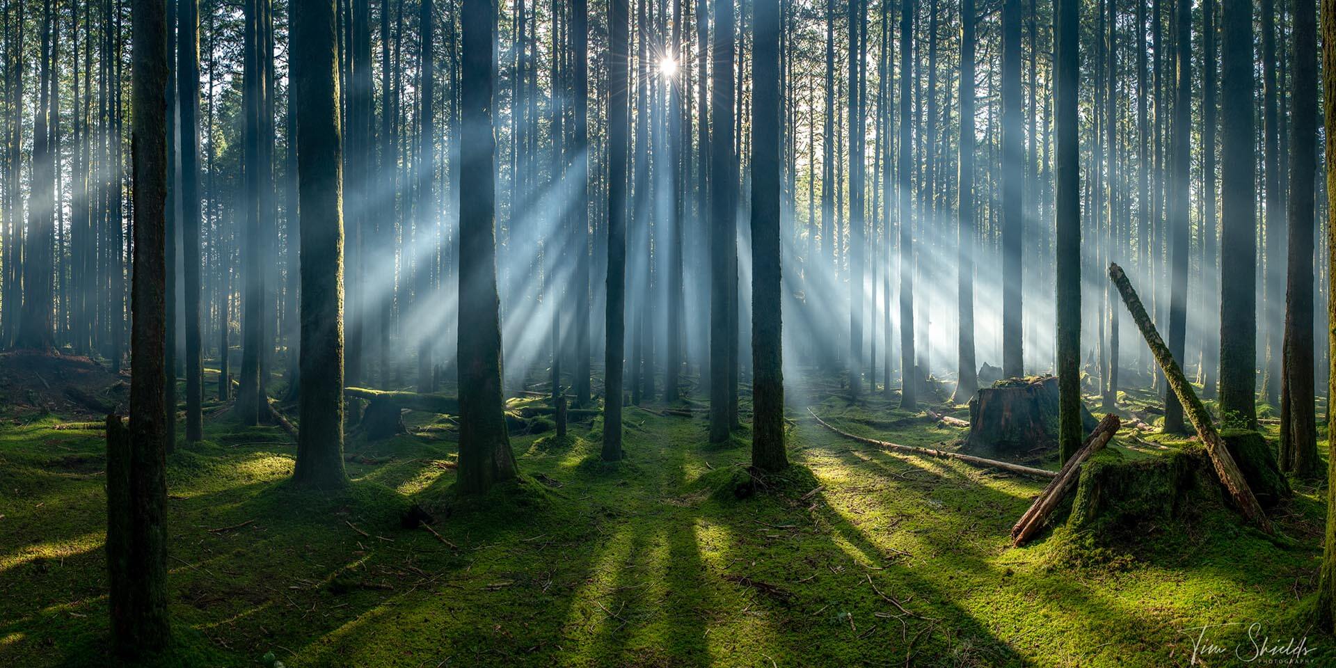
Another way to introduce sharp/blur contrast is using fog. The reason photographers salivate over getting up early for those perfect fog shots is because of the contrast it adds to images. Fog blocks out distractions in the background and simplifies an image to what the viewer is able to see clearly. It also slowly blocks out the subjects behind the main focal point of the image, drawing the eye further and further back as they’re trying to make sense out of what they’re seeing.
Cloud shots from mountain tops or airplane windows achieve exactly the same effect. Keep tabs of the fog in your local weather forecast, and plan to go out to a location you’d shot previously, but didn’t get the results you wanted. I guarantee that extra layer of contrast will make the image that much better.

What can I do to learn more about photography?
The best way to learn is to practice. If you have the ability, go out and shoot on your own in the early mornings looking for compositions. I guarantee that if you learn my 4-Step system for photography, you’ll come home with some amazing, wall-worthy images every time you go out. You can learn about that system and more with my free online web class. It’s full of information and guides that I’ve developed over my years as an award-winning landscape photographer.