The secret to making beautiful photos is as old as photography itself. Dodging and Burning has been around since light was first recorded onto glass plates. It’s a technique so powerful, that Ansel Adams once said “ Dodging and burning are steps to take care of mistakes God made in establishing tonal relationships.”
Thankfully, you don’t need to get a lung-full of caustic fixer in the darkroom to use Dodge and Burn. Lightroom has some simple, and effective ways to allow you to dodge and burn quickly and accurately.
[twenty20 img1=”1549″ img2=”1547″ offset=”0.5″ before=”Before dodging and burning” after=”After”]
But to start, let’s get an understanding of where these terms come from.
If you’ve never shot with film, the camera creates a negative image where the dark parts of the negative turn into the bright parts of the photo. . So when a light source shines through the negative, the dark parts block the light from reaching the paper, making it brighter. Two negatives make a positive, right?
So in the darkroom, dodging is when the printer would block the light from hitting a certain area so it becomes brighter. Burning is when they would direct more light onto a specific area to make it darker. The pros would spend entire days marking up print after print to make it perfect. Today, we can get the same results in mere minutes!
Get started in Lightroom Classic
 If you’ve got the basics, skip to the next section by clicking here. For those new to Lightroom, it can be a daunting program to get the hang of.
When you open Lightroom, you’ll automatically start in the Library mode, which shows you all of your image thumbnails in a grid. This mode will allow you to organize and manage your photos, review sets, and perform quick edits. In the bottom left-hand corner of the screen are the grey Import and Export buttons.
You can import your photos from your computer hard drive or any external hard drive that you have available.
What If I change the name or location after importing into Lightroom?
Once you’ve imported your photos, you can change the location, or rename the folder they’re in, but you will have to relocate the folder within Lightroom. If this happens, you’ll see an exclamation point on the image thumbnails at the bottom of the screen in both the Library and Editing modes.
Click on the exclamation point of the first photo in Lightroom, and go to the location where you moved that photo on your hard drive. Once you find it, Lightroom will automatically locate the rest of the photos in that folder.
How to select the best photos for editing
The beauty of shooting with digital mediums is that it doesn’t cost money every time you click the shutter. Sometimes I end up shooting way too many photos — luckily it’s easy to go through and choose favorites.
Stay in Library mode, and on the bottom right side of the middle panel there is a slider with the word ‘thumbnails.’ Moving that slider to the right will allow you to see the thumbnails larger.
I usually have 3 images side-by-side so I get enough detail, and can still see the images before and after. If you want to see the images closer, you can double-click to see the full image. Click again, or hit the spacebar, to zoom in and check for sharpness.
Hotkeys and shortcuts for culling your photos
Once you’re setup properly, you can get through an entire set of images in Library Mode without ever touching your mouse!
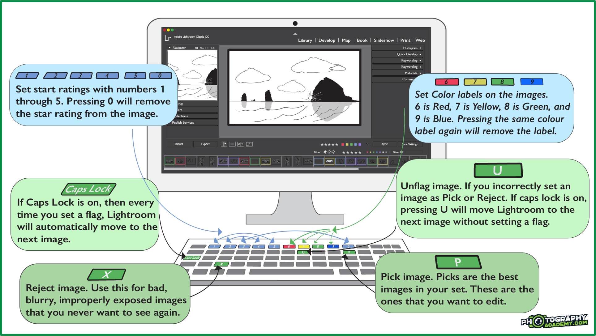
Press P to set a picture as a “Pick.” Pressing X will set a picture as ‘Rejected.’ And Press U to ‘Unflag’ an image that you accidentally set as Picked or Rejected. You can also filter the images by stars, using keys 1, 2, 3, 4, and 5, or by colors using 6, 7, 8, and 9. If you use the 0 key, it will remove the star rating from an image.
Going through the sets using these keys is easy. If you want to set a label and move on to the next image, turn on Caps Lock and Lightroom will automatically go to the next photo once you’ve set a label using the above hotkeys.
How I cull my images
Typically, I only Pick and Reject photos rather than give a star rating. But I like to use the Red color label to signify if the photo needs Photoshop work, Green to say Photoshop work is complete, and the Royal Purple to signify an image is ready to print.
Once you’ve chosen your images, you can turn on filters by hitting the Light Switch button on the bottom right-hand corner, underneath the editing panel. If you click the word Filter, you can choose to filter images by flags (picks, unflagged, rejected), color labels, or star ratings.
If you want to save room on your hard drive, you can select all of the rejected files, right-click, and remove them either just from Lightroom, or Delete from Disk to put them in the trash.
Now to start editing.
This is where the fun begins. On the top right of the screen, you switch from Library mode to Develop mode. This is where you’ll be able to do everything from calibration and lens corrections to dodging and burning.
If you have any presets, they can be used or uploaded from the top left panel. Presets are a wonderful way to stay editing, and they can help you learn to make your own style, and keep your entire set of images looking cohesive. Every pro I know makes their own presets, because they’re an invaluable tool to get the exact look you want in a fraction of the editing time. If you want to get started with presets, you can check out the Preset pack that I’ve developed over my years of photography.
If you find that your images don’t have enough detail in either the bright parts
of the dark parts, there’s a simple technique, called HDR photography, that will set you up for success. You’ll need a tripod to make it work, but the results are absolutely astounding! If you want to learn more about getting great results when you’re out taking photos, check out my Photography Cookbook, which has my top 30 recipes for making stunning Fine Art landscape photos in the field!
Let’s start dodging and burning
Dodge and burn in Lightroom are local adjustments. There are three tools to help you dodge and burn, called the Brush Tool (K), the radial filter (Shift + M), and the graduated filter (M). They’re located above the adjustment panel, just underneath the histogram on the top right.
Each too has a different purpose. The graduated filter will let you affect one side of the photo, with the effect gradually disappearing on the other. So you could darken the top half of the image, such as the sky, but leave the bottom half unaffected. You can also use this to add contrast, lift shadows, add saturation, dehaze, or even add warmth and coldness.
The radial filter works the same as the graduated filter, but just in a circle instead of in a hard gradient. So you can use it to brighten a person, who might have had the light behind them, leaving them too dark to see.
These two filters work quickly and effortlessly to dodge and burn specific parts of the image.
setting up the brush tool
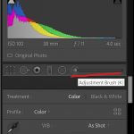
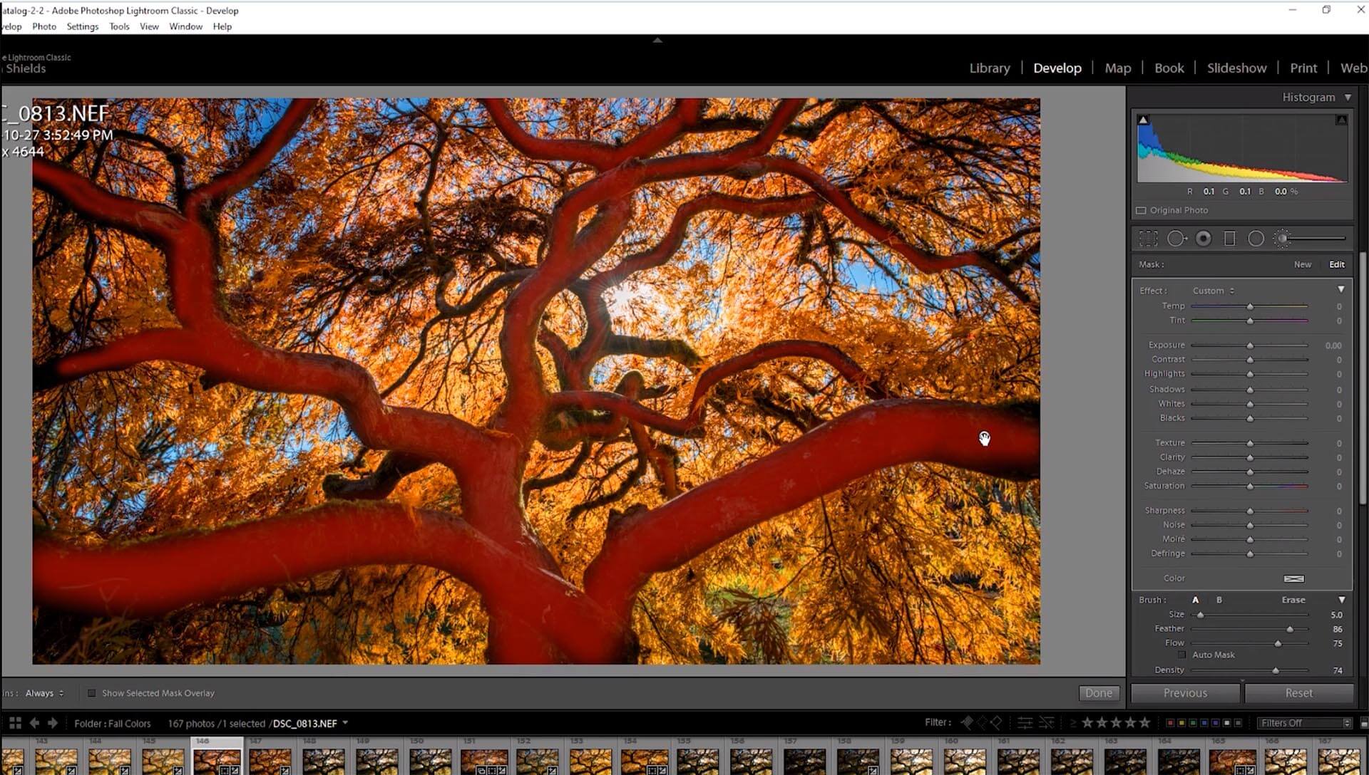
But the real power comes from the Brush tool. You can select this one on the top right, or simply press K to make a new brush. Using the scroll wheel or [ + ] keys, you can make the brush larger and smaller. If you hold shift, you can make the feathering, which helps blend the effect, harder or softer in the area your brushing.
The same controls can be found using sliders at the bottom of the basic panel when you have the brush tool open. Underneath the size and feathering brush, there’s also the flow and density controls. Flow is how fast the effect will show when you’re brushing. If you want a lot of effect fast, move the flow slider to the right. If you want to be careful, turn the flow down.
Density controls how strong the effect can be in total. Leaving density to the right usually makes the effects pretty strong, even when making small adjustments. I usually keep my density at 70 and change the flow depending on my task. If I don’t need to be crazy accurate, I keep the flow down so I can go over the lines, but when I’m dodging or burning something very small, I’ll keep the density high so I’m not going back over the same spot, increasing my chance or making errors.
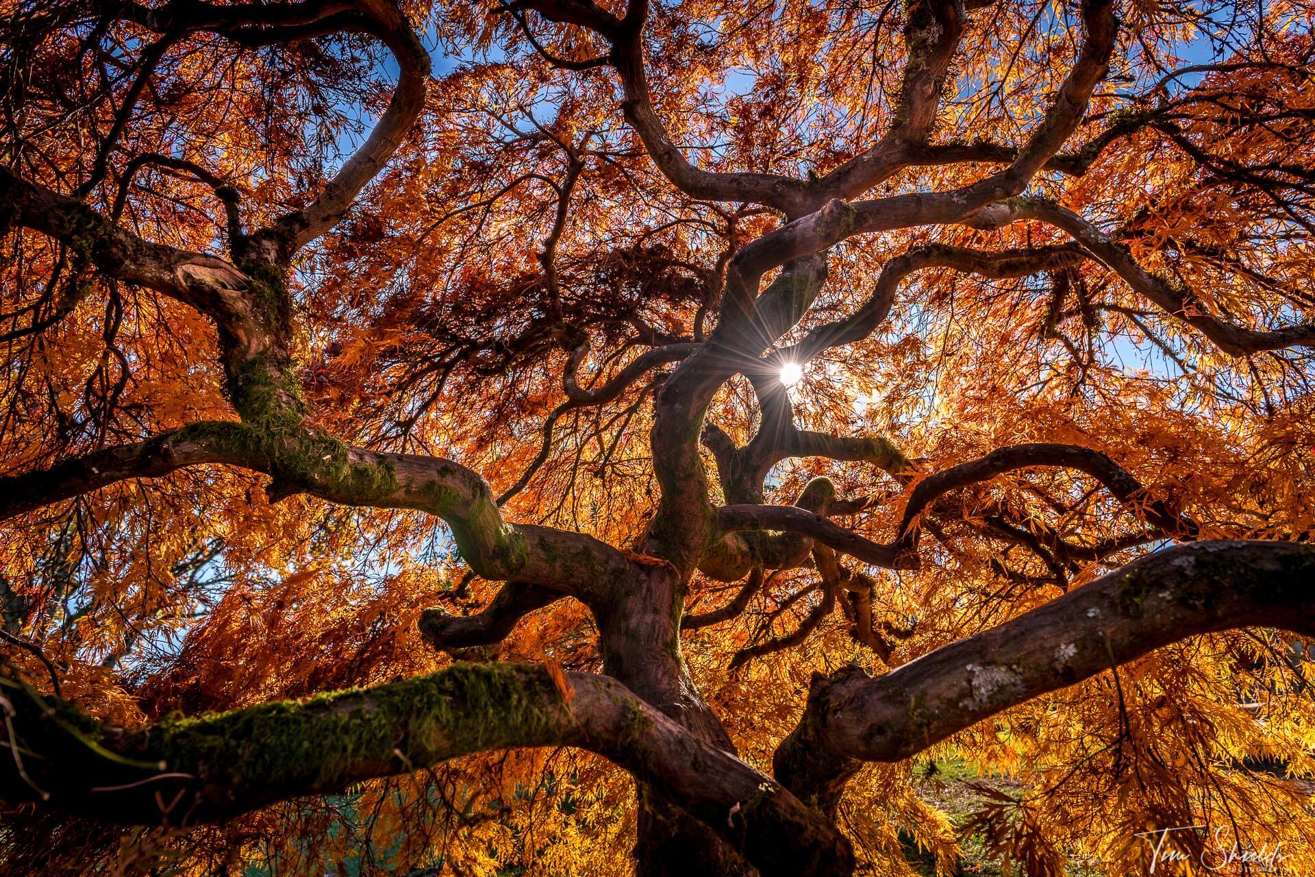
For this image, the values I increased the exposure on the brushed areas by 1.75 stops and added in both sharpness and dehaze to make the final image. Here’s what my brushing looked like:
What do I dodge, and what do I burn?
This is the real key. A successful editor will make the subject of the image brighter, and make the distracting elements darker. Try dodging different elements of a scene, and seeing how it changes the overall image. Bad editing will leave halos around the subject, or dark areas around the places they burned. It’s best to use a soft touch when you can, leaving the heavy lifting up to the sliders in the basic panel, and then getting the areas that the sliders don’t fix with dodge and burn.
And here’s the final image:
 This takes some time to get good at. And with editing, it’s always best to be subtle until you know what you’re doing. These programs take time to learn. If you want to get some more tips on using Lightroom to create fine art landscape photography, check out my Lightroom Jumpstart guide. It has everything you could need to make your stunning photos even better.

